Managing high-volume,
multi-region banner production
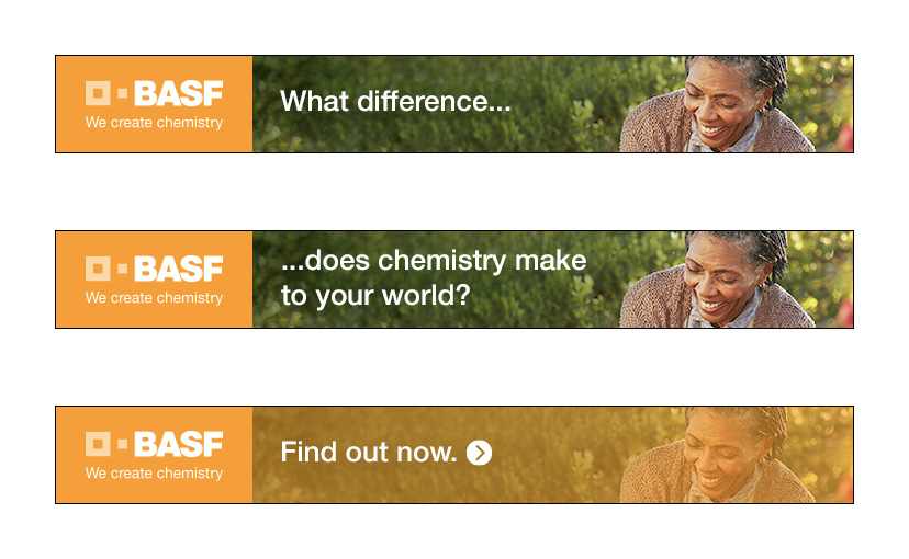
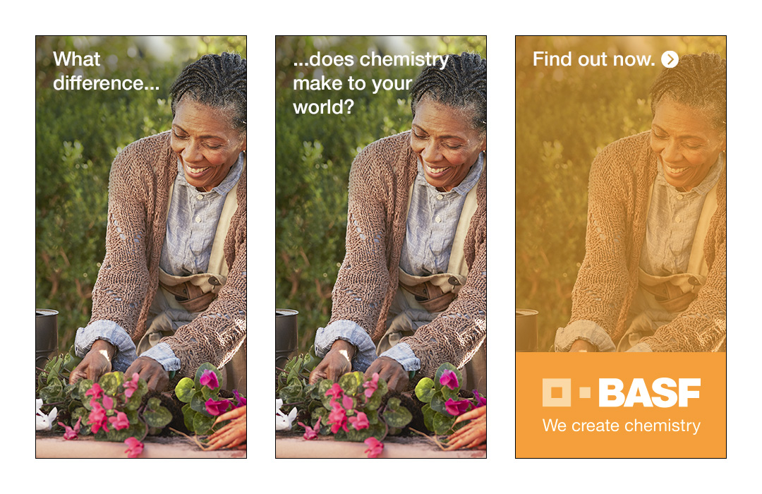
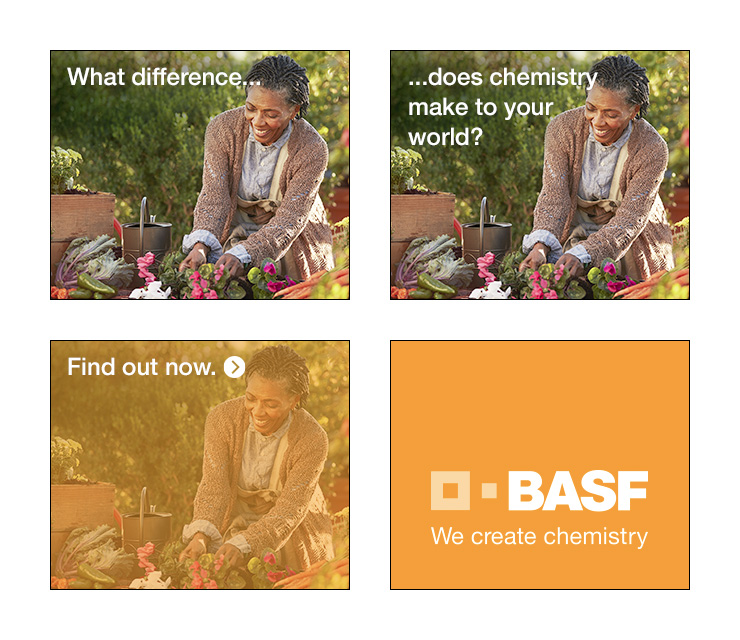
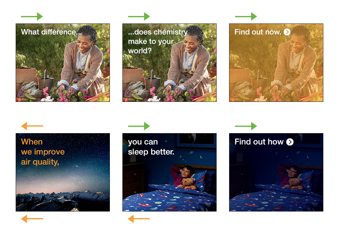
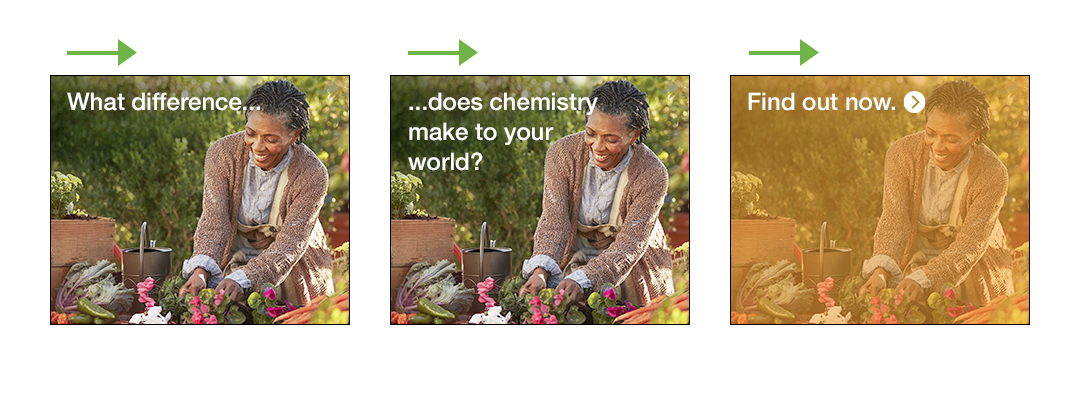
All BASF WCC banners follow one of three basic variants depending on their shape. Each of these variants would then animate in one of two slightly different ways, depending on whether the creative route required one background image or two.
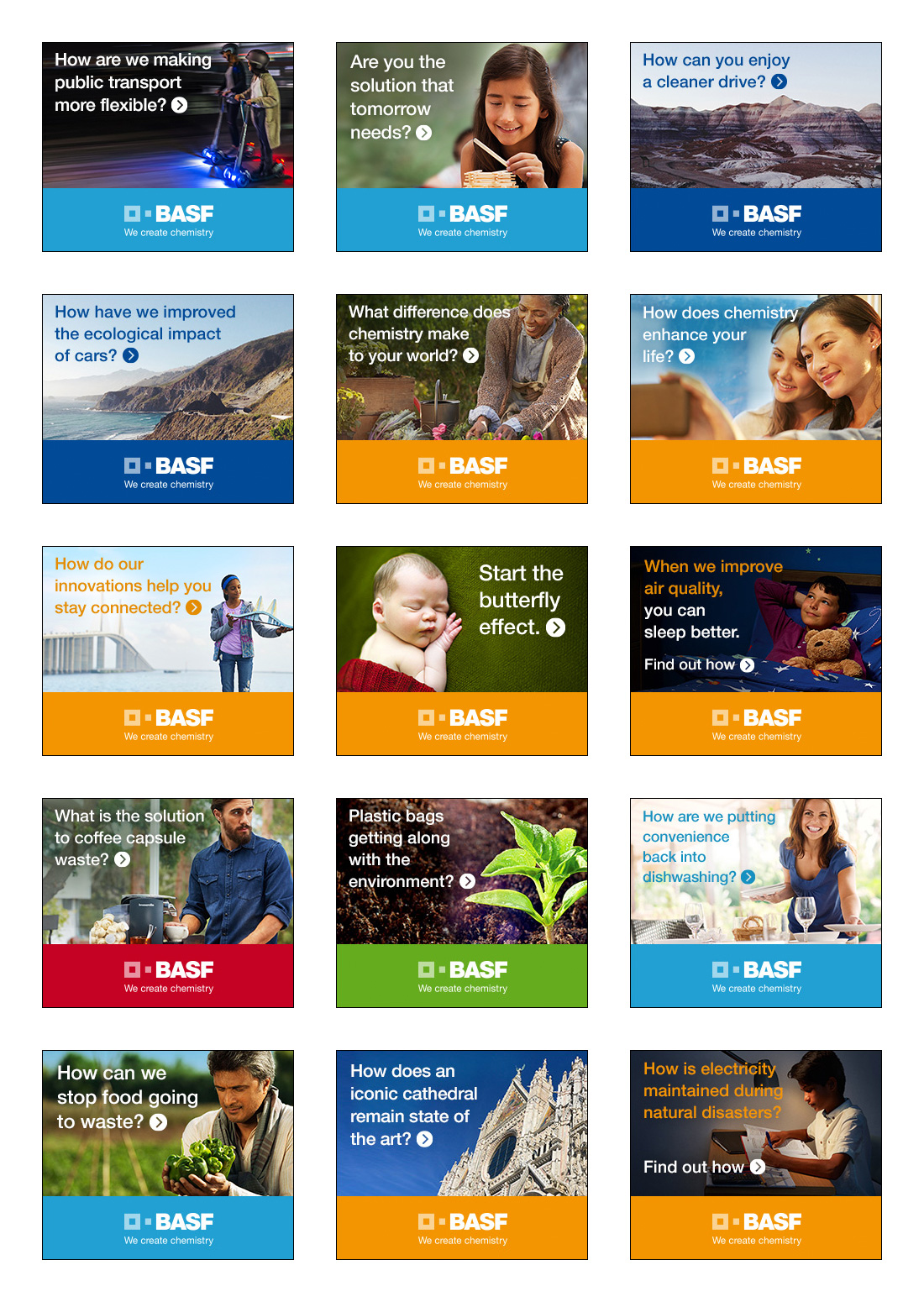
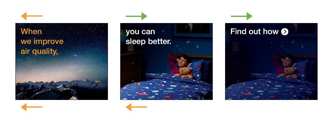
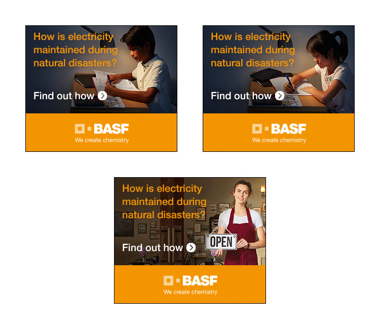
In total there were fifteen different 'proof points' in use for BASF WCC banners - different creative routes with their own, distinct copy and key imagary - and each set of banners produced would need to be adapted (or transcreated) according to region, often requiring translated copy, alternate fonts (where special characters were required) and regionalised versions of the key imagary.
An example of a typical media plan might require twenty different formats that were to be produced for three different regions, using five different proof points, making a total of three hundred deliverables (give or take the odd region-specific format). These media plans were sometimes smaller, sometimes larger, but they would come through on a daily / weekly basis, often with very little warning, and would need to be designed, built, tested, approved and delivered within a matter of days.
Whilst the work that had been produced in the past was OK (i.e. it was ticking enough boxes to be approved), it just didn't look like it was being shown much love? Brand colours and logo placement were inconsistent, as were the treatment of text and CTAs, the wrong animated sequences were often being used for the wrong formats, and there didn't seem to be much effort being put into asset preparation (for example, if an image didn't fit the given space, the space was simply being faded out to a solid colour, when the scenes could often be extended in a more subtle fashion with a bit of time invested in some minor artworking at the start). In short, everything that was being produced felt rushed and pressured, and the overwhelming impression I had on taking over was that the team were starting to struggle with the relentless pace of the workload - a problem with organisation and process, rather than technical ability.
The challenge, therefore, was to raise the overall standard of work that was being produced for this client, and to implement a series of operating procedures and strategies that would allow the team to handle the volume of work expected with precision, efficiency and absolute confidence.
Working closely with the lead front end developer, we completely overhauled the working processes and practices across both the digital design and development teams. For development, this meant using Gulp or Grunt to run a series of automated scripts that would instantly produce the basic HTML, CSS and Javascript files (and the folder structure) needed for any number of formats specified. For design, the changes required were little more involved.
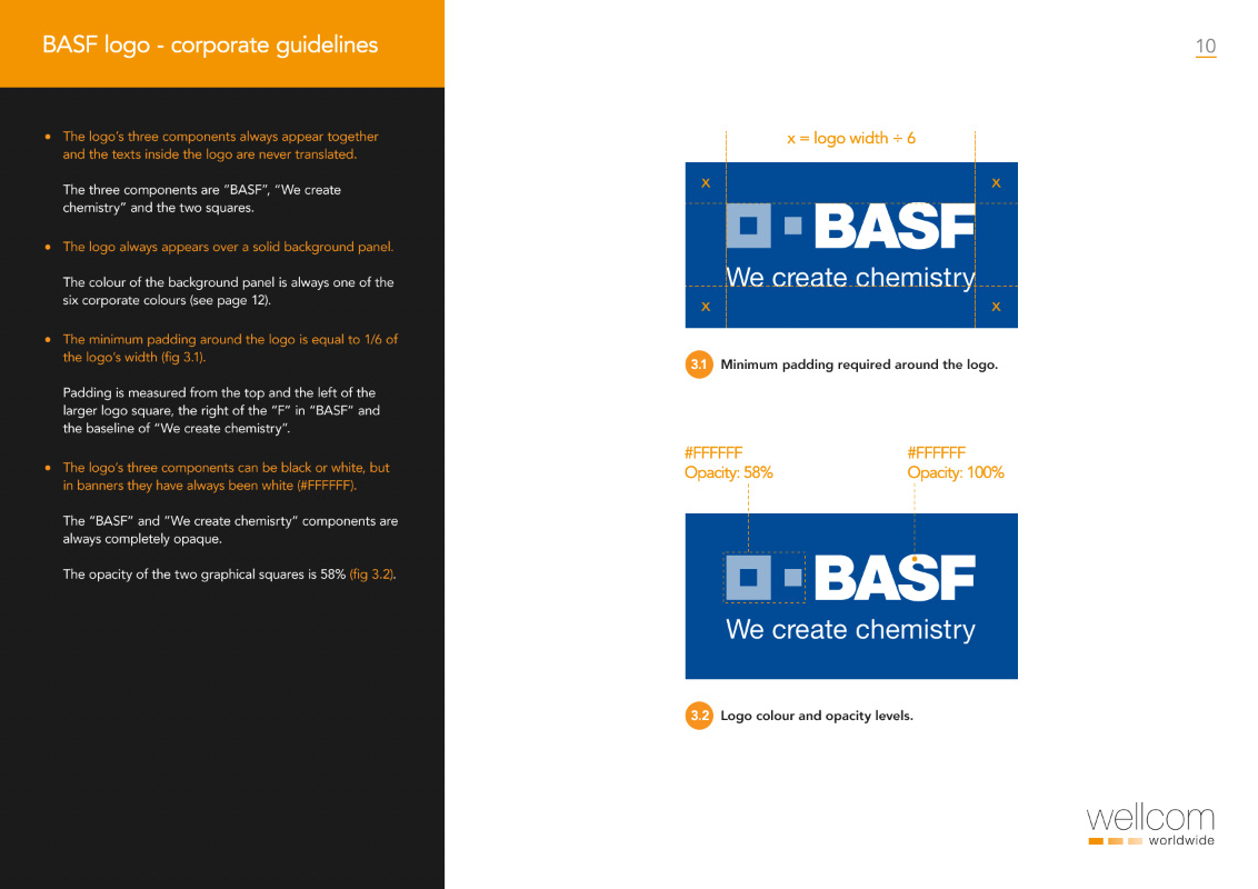
Before anything else, it was first necessary to create a much-needed set of production design guidelines for BASF banner work (see below) - this document, in combination with the more generic asset production guidelines (case study coming soon) that I was also establishing, provided the design team with a clearly defined set of standards to work to, as well as a manual of best-practice methodoligies that they could always refer to.
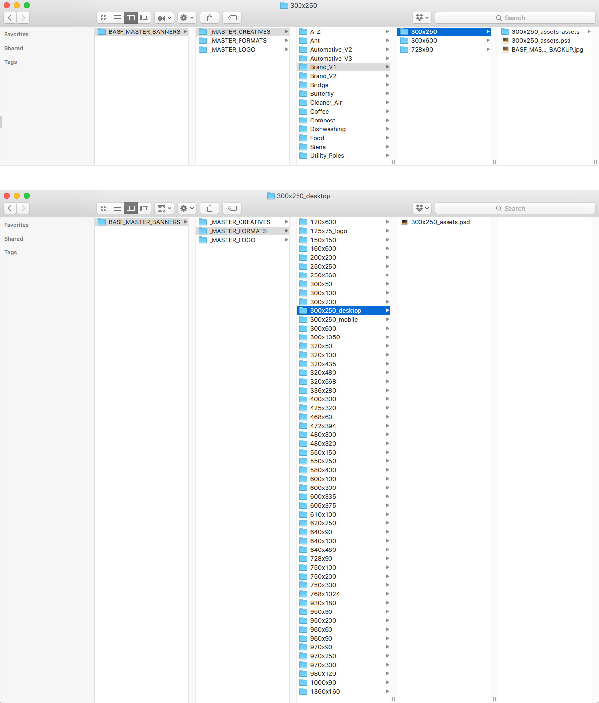
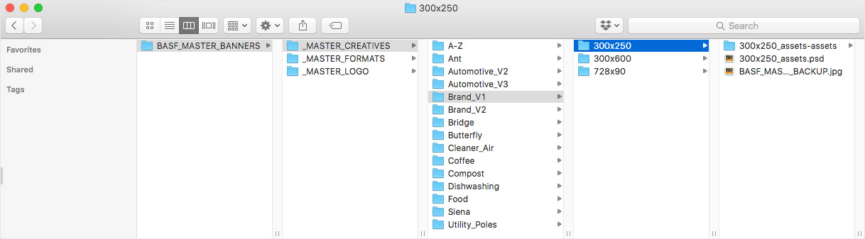
We then began the task of setting up two template libraries for the design team's use. The first of these was a '_MASTER_CREATIVES' library, and contained small sets of approved, 'master' PSDs (along with published build assets) for each proof points. Typically, these Master sets would include one square format (e.g. 300x250), one 'letterbox' format (e.g. 728x90) and one 'skyscraper' format (e.g. 160x600 or 300x600), the idea being that, if the creative concept worked in each of these distinctly different shapes, then it would likely work in any format that we encountered.
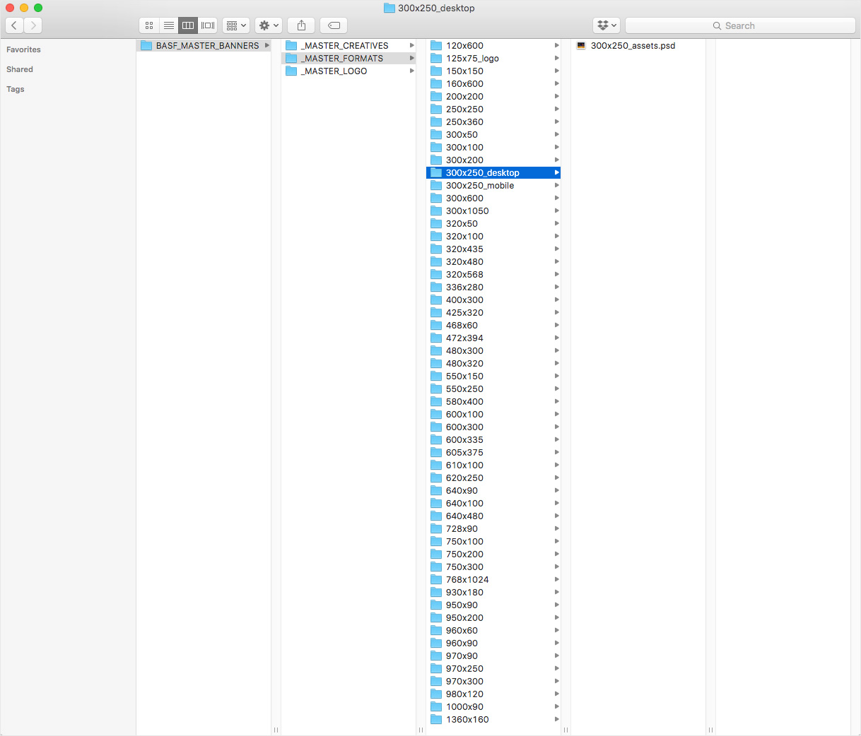
The second template library was the '_MASTER_FORMATS' library, which contained a single layout PSD for each unique format that we produced. Each PSD in this folder defined how essential brand elements (such as logo size and placement) should be treated in each unique format, ensuring consistency between different creative variants of the same size.
Between these two librariers, any designer working for us was able to produce a layout PSD (and a complete set of build assets) for any new formats in mere minutes! The exact positioning of essential elements could be taken directly from the matching (or closest matching) Master Format, and the creative elements could be taken directly from the appropriate Master Creative - from there, all that would then be required was a couple of colour changes, some quick resizing of background images, and some copying and pasting of translated copy (if necessary). Easy!
Within a couple of months the digital department had become a well-oiled production machine! Using teams of just one designer and one developer (often working remotely in Manila or Kuala Lumpur), we were able to produce sets of (literally) hundreds of layout files, build assets and animated HTML5 banners incredibly quickly (often inside of a day), with precision and accuracy. Not only did this result in an extremely happy client, it also meant that significant amounts of time were freed up each week for the team to devote to other tasks, allowing us to drastically increase our productivity and profitability.
Through the use of our template libraries and production guidelines, we were able to standardise the way that all design files were structured, meaning that any of our designers could pick up anyone else's work and immediately start working with it, knowing where everything could be found. It also meant that we were able to standardise the way that build assets were generated (e.g. dimensions, file type, naming conventions, etc), which allowed the development team to make significant time savings when it came to things like basic set up, positioning and cross-browser testing.
Finally, this structured, template-driven approach meant that we were effectively starting each new job with assets that had been pre-approved from previous work, and this allowed us to drastically cut down on the amount of time that was being lost to the review process. Most jobs were generally approved by the client first time, and we very rarely had much (if anything) in the way of feedback to implement.
I acted as digital brand guardian, art director, lead designer, mentor to junior designers and developers, advisor to both the project management and development teams, and an extra pair of eyes on technical QA on this account.
• • •
Need help with a similar, high-volume campaign?
The brief
One of the main responsibilities that I inherited as the Senior Digital Designer at Wellcom was to take the creative lead on all digital design and production work for the BASF 'We Create Chemistry' account (one of Wellcom's largest, retainer contracts), and act as a Digital Brand Guardian for this important client.
Alongside BASF's global website maintenance requirements, a significant part of this account involved the production of incredibly high volumes of display advertising communications material for multiple regions across Europe, Asia, the Americas, Africa and Australia. On a creative and technical level these ads were relatively straightforward (as most high-volume work tends to be) - the complexity of the task came from the ongoing organisation, management, art direction and QA of such vast quantities of production work, and from maximizing the speed, accuracy and efficiency of our working practices.