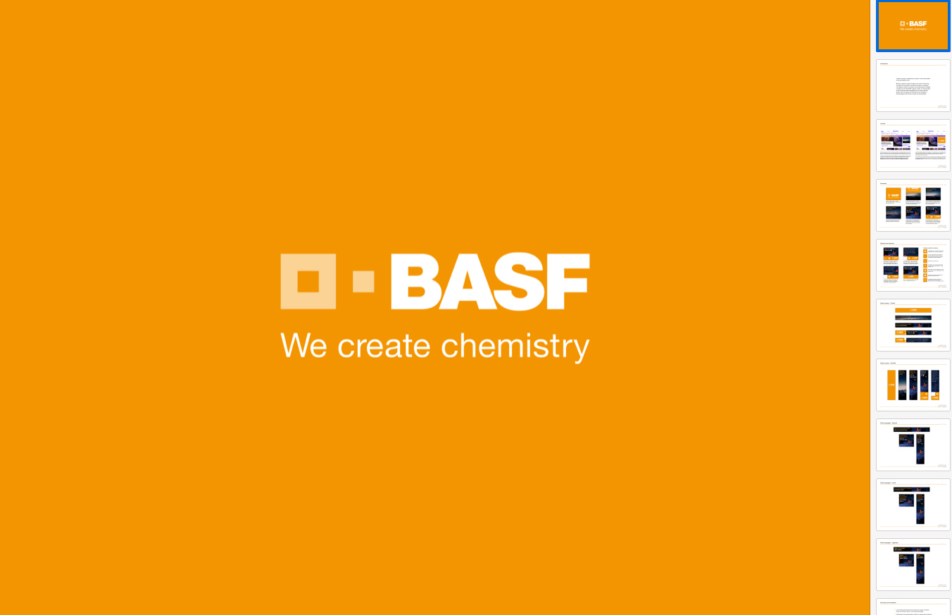
Proposed redesign of standard HTML5 banners.
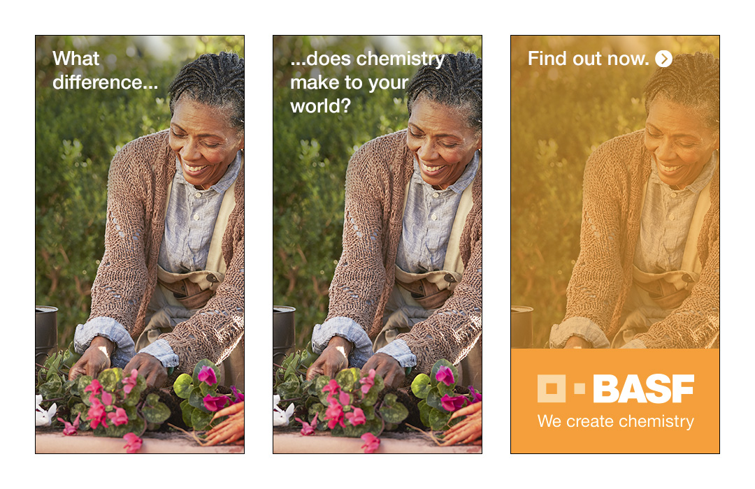
However, we wanted to present more than just the standard storyboard, and so the final document also included a contextual analysis of where the ads would be displayed, examples of adaptations / resizes and transcreations (to demonstrate that the concept would work in extreme format shapes, and that it could handle copy of any length), and suggestions for additional interactive elements for the end frame that could be easily implemented, even within the constraints of standard banner ad specs.
Unfortunately, before we could present these recommended changes to the client, BASF appointed a new Creative Agencies, and all creative proposals were suspended! Terrible timing from our point of view, but it was still a nice, unusually detailed piece of work (certainly as far as banner proposals go), and many of the recommendations could be easily applicable to any standard banner concept. You can view the final document below.
Apart from some basic direction at the start of the brief, and some feedback at the end, I was kind of on my own with this one. It was a pure design job, so it was my responsibility to research the ideas. mock them up and create the presentation document.
• • •
Need help with a similar pitch or proposal?
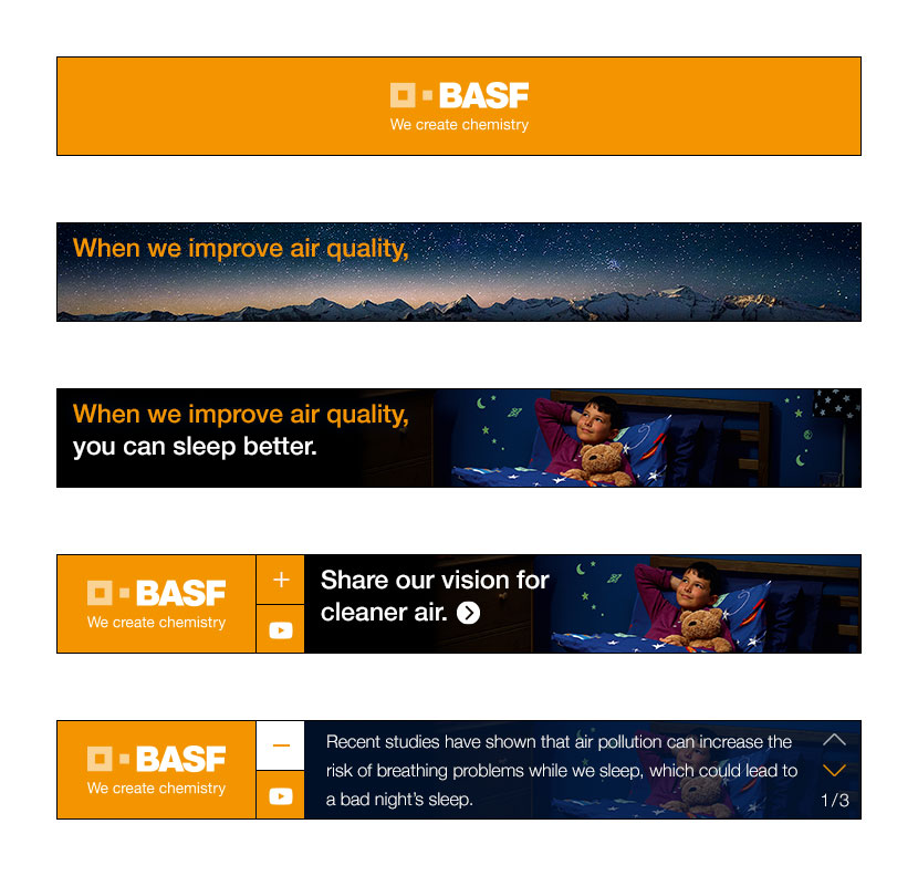
The brief
Having handled BASF's digital production concerns for a number of years, the digital team at Wellcom were in the ideal position to be able to advise on how the design and production process for their standard HTML5 banner ads could be optimized for greater impact and improved performance. As BASF were in the process of introducing two entirely new sections (or 'proof points') to their "We Create Chemistry" campaign at the time, and would be requiring two new sets of 'Master' banners anyway, we saw this as the ideal opportunity to make some recommendations and showcase some of our team's creative capabilities.
The challenge
Whilst certain changes were undoubtedly needed, we were unableto deviate too far from the existing creatives that were in use for a couple of reasons. For one thing, there simply wouldn't have been the scope to implement anything too wildly different, as the work involved in bringing all of the other integrated web and print material in line would have been prohibitive. And for another, the high-volume, short-notice nature of the media plans and production schedules meant that the concepts would have to remain relatively simple and easy to execute.
The challenge, therefore, was find subtle tweaks and recommendations that would improve performance and could be easily implemented, but without requiring sweeping changes to all other, integrated campaign material.
Action taken
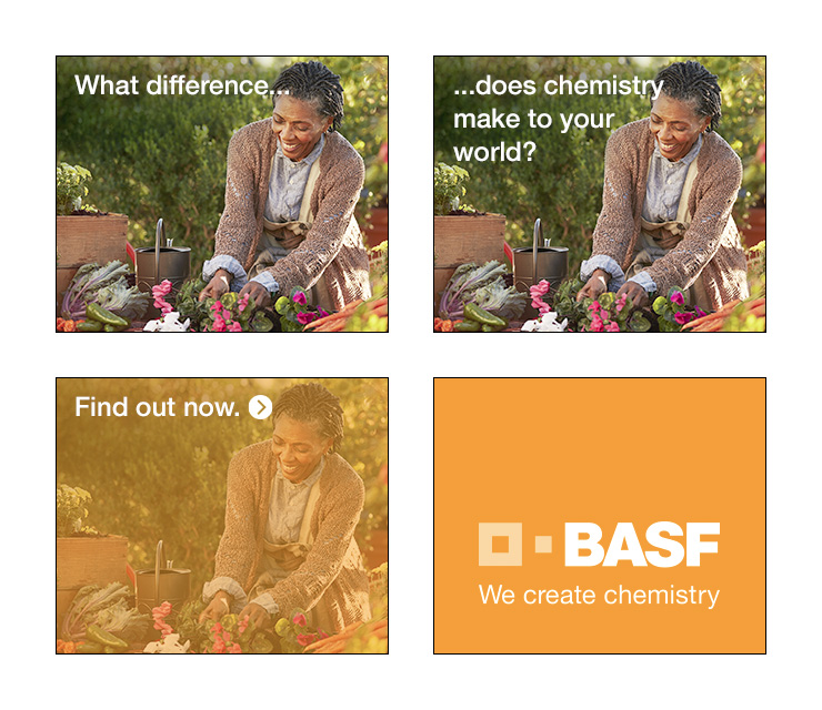
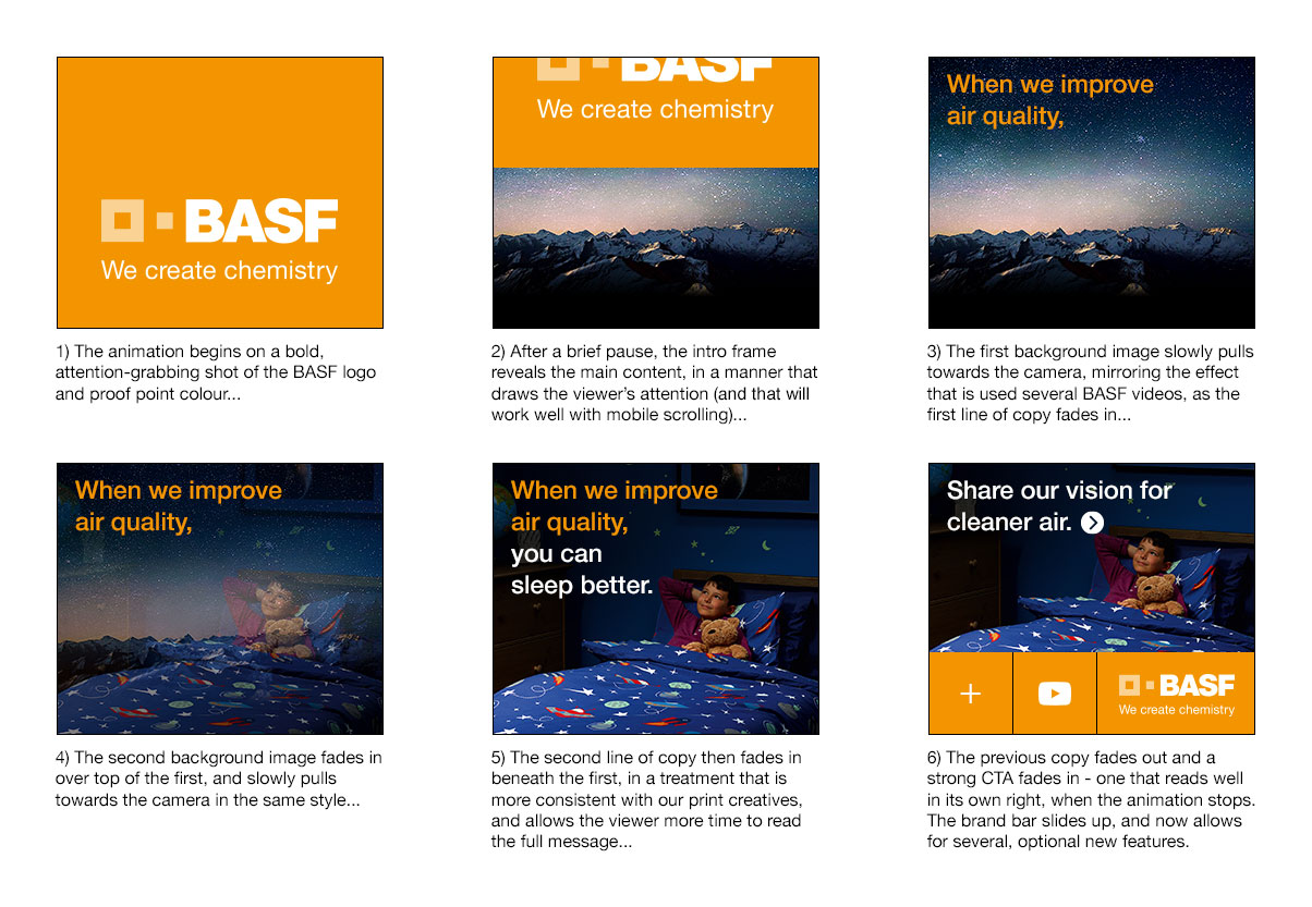
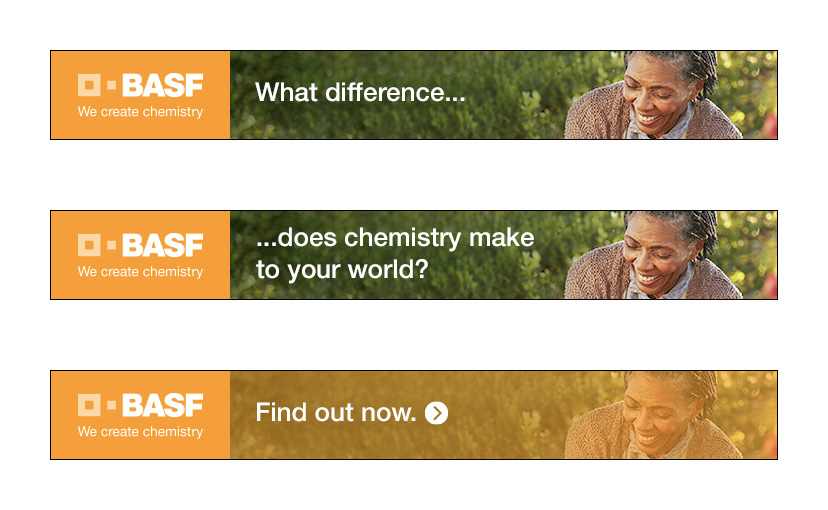
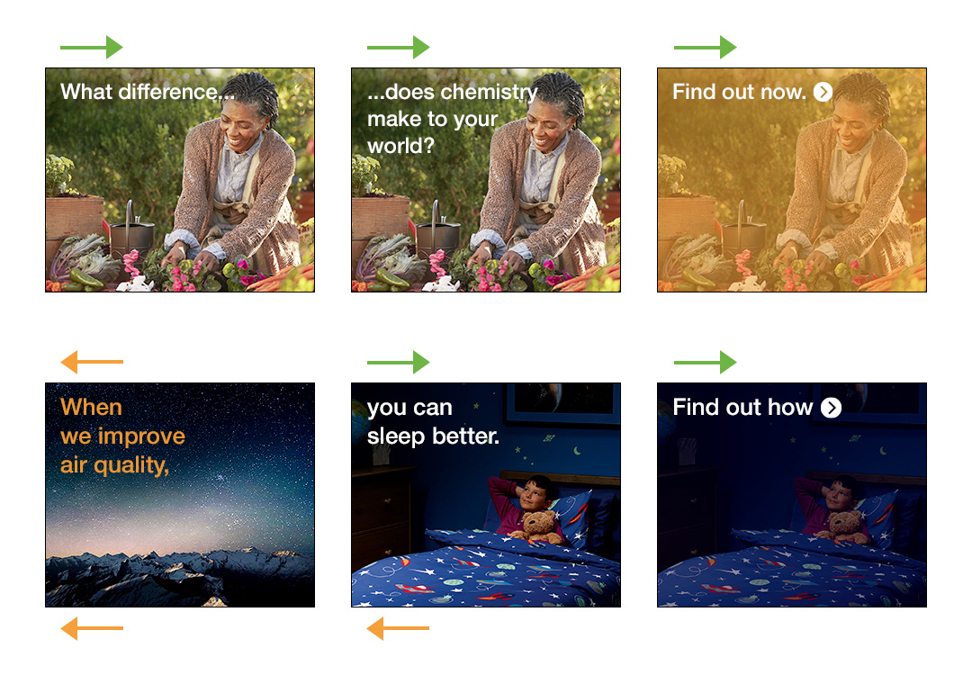
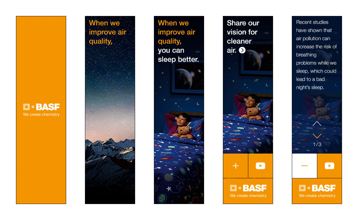
The first step was to identify all of the ways in which we believed these banners (and their production guidelines) were sub-optimal, such as having six master animation sequences to follow (depending on the format) when a single sequence would have been more than sufficient for every format, and how the banners would often stop on an end frame with a weak CTA that simply read "Find our now >" . We then created annotated frame layouts and animation references for the changes that we were proposing.